

 A good design can make or break a website. The bottom line should be a straight-forward presentation that is easy to understand and use. Here are several things for you to consider to achieve a functional and easy-to-use website.
What are my objective(s) and target audience?
A little critical thinking before kicking-off a website design project will pay dividends. Here are some things to keep in mind when planning your next webdev initiative:
- Start by branding your site; have a strong, recognizable name and slogan.
- Consider a logo that promotes brand recognition, or a shared impression among consumers.
- Your key message needs to be direct and clear.
- Look yourself up! Search Engine Optimization (SEO) is extremely important. The easier your site is to find, the better!
- Keep your content Evergreen (SEO content that is continuously relevant and fresh for users).
Do I understand my user(s) and their needs?
Who is your average user and what motivates them? Three things that influence a user’s external searches are; ability, motivation, and cost v. benefit. Do they consistently access the site or do they rely on search or related links to find and navigate? Most users rely on menus to find content so your menu should always correspond with user tasks. For good measure, the site should also show the current page as well as links to previous pages.
Demographics (gender, age) and psychographics (thought processes) should be considered as well. Psychographics could help more by providing insight into a user’s experience level and cognitive ability.
Where should I start?
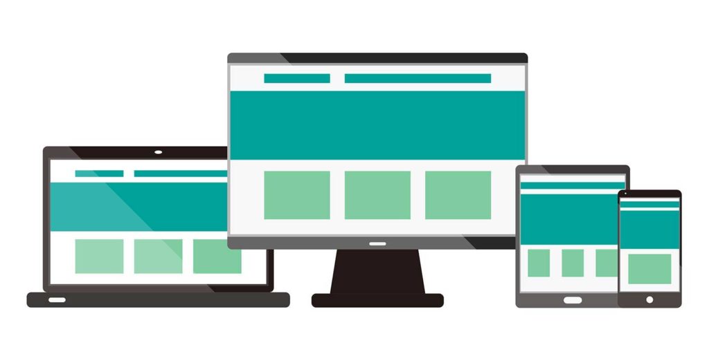
 KEEP IT SIMPLE! Avoid clutter at all costs! A fast and simple interface is first thing a user will notice. Putting together a simple cognitive map can help create a profile for your audience’s capability. This can show the individual’s attention span, text comprehension skills and spatial working memory. From there, you can create a fitting theme/design that will make a positive impact. Make sure your website is easy to read, understand, and navigate. Most people use their phones to browse the web, because mobile-optimized navigation conserves screen space. However, catering to a mobile design will impact the desk design.
Formatting tips to ensure ease-of-use.
Formatting content to make consuming your content is important. If you are unfamiliar with content formatting best practices, here are some useful guidelines:
- Title and headings are distinguished by color, weight and size
- Strategic use of white space help our eyes adjust easily, which helps the content stick.
- Key info presented first in a simple straight-forward way.
- Utilization of bullets, bolding, and numbering to highlight important content.
- Consistent placement of navigational elements.
- Content is organized by broad categories, proceeds from general to specific, and have reasonable limits.
- Avoid horizontal scrolling, automatic moving images and scrolling text (graphics, pop-ups, start up screens, etc.)
What tools work for my audience?
 Hamburger menus are those small menus typically in top right corner of the page. This can offer a clean, sleek look that most people are familiar with. However, hiding everything in a hamburger can reduce discoverability of other content. FrontPage carousels are great at reducing clutter but are bad for SEO. The lack of content means it’s difficult to get Meta info into a page which can adversely affects performance. Carousels also push content down, making information seem inaccessible. Complex typography and load screens will slow your website down and negatively affect users. MegaMenus are large drop-down menus that include several levels of links to help users preview lower-level content in context.
This can in turn expose deep content to desktop users. A solid tool to utilize is Global Navigation. This allows users to switch between top-level categories easily, regardless of current location. It also ensures that even users who don’t enter through the homepage can quickly get a sense of what is available on the website.
Research is Key!
Research, Research, Research! Utilizing analytics is incredibly important for integrating site data with user experience For example, user behavior, such as skyrocketing bounce rates in landing pages, shows you where users are clicking. Qualitative data, such as user feedback, can help solve complex issues users are having. Quantitative data can show you where users are spending the most time and for how long. Crazy Egg is a service that uses heat-mapping to show how users navigate your site and what they click on.
Using Stat-counter can help manage click-tracking and Google analytics will organize your data. Doing a media content analysis can help you better understand engagement and behavior metrics and market segmentation can help you narrow in on your target audience. Establishing contact with engaged users can be an excellent way to fine-tune your site. This will let you build a list on influencers within your marketplace and help define your audience.
Contact 321 Web Marketing for Professional Website Assistance
Is your business just starting out or ready to grow online? A well designed website that is fast, scalable, and secure will be essential in meeting this objective. 321 Web Marketing has helped organizations of all sizes design or improve their websites. Contact 321 Web Marketing online or call our office directly to learn how we can benefit your organization today.
sources:
- Awwards
- Nngroup
- Measure What Matters (Paine, 2011)
- Multimedia Journalism (Bull, 2010)


